The Color Trends Forecast for 2026:
Every year, paint companies give us a snapshot of the cultural mood, and the 2026 Color of the Year selections speak volumes. If you were tired of cool grays, rejoice! This year marks a confident and soulful shift toward palettes that are grounded, rich and deeply restorative. I am here for it. Designers are unanimous: we are moving away from stark colors and embracing shades that reflect the comfort of the earth and the complexity of nature.
Key trends for 2026 are clear: The Return of Brown, Sophisticated Warm Neutrals and Deep, Organic Greens.
We’ve gathered the top selections from Benjamin Moore, Sherwin Williams, Behr, PPG, and Valspar. Get ready to explore five stunning colors-from espresso-rich drama to serene, misty jade-and learn exactly how to use them, and what to pair them with, to transform your home.
Group 1: The New Depth in Color Trends
This group represents the trend of sophisticated, moody colors that add tailored drama and luxury, moving beyond stark blacks and cool navies.
Benjamin Moore Silhouette (AF-655)

A rich espresso brown with charcoal undertones, creating a deep, refined “almost black.” The Design intent of this color is Tailored Drama. To create a n immediate sense of gravity, formality and old-world luxury. It is grounded without feeling heavy.
Pair this with warm textures: Natural oak wood tones, cognac leather, and creamy linens.
Contrast with warm whites like BM Swiss Coffee, Muted Clay Pints, Aged Brass
Behr Hidden Gem N430-6A
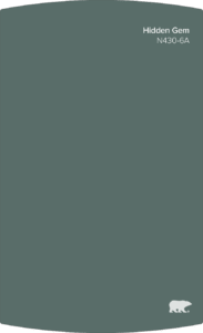
A Smoky Jade: a mysterious and sophisticated blue-green jewel tone.
The Design intent of this color Jewel Box Effect. To create spaces that feel grounded and alive, offering a rich sophisticated ambiance.
Pair with metals like polished brass or copper, and high-gloss finishes or velvets. Balance: Warm Khaki like SW Universal Khaki, Terracota, Soft Coral
Group 2: The Essential Neutrals in Color Trends for 2026
Sherwin Williams Universal Khaki (SW 6150)
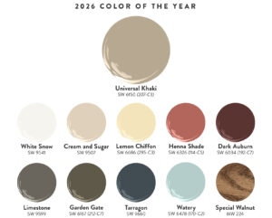
This color embodies the dominant 2026 trend: the definitive shift from cool grays to warm, sophisticated, earth-toned neutrals.
It is a mid-tone neutral that successfully bridges beige and taupe. It has a warm, earthy tone that is exceptionally versatile.
The Pairing focus for this is Materiality: Pair with natural finishes like woven rattan, limestone, wool rugs, and dark wood for a rich layered texture. You hear me talk a lot about texture. More to come.
Contract with crisp white trim, deep teal, rich navy (for accents). Don’t go too heavy with the teal and navy. Personally, I would keep them at about 10%. Just enough to pop.
Group 3: Restorative Greens (The Nature Nurturers) in Color Trends for 2026
These colors illustrate the continued, strong connection to nature, offering two distinct paths: a lively, vibrant green and a soft, calming green that acts as a neutral.
PPG Secret Safari (PPG1110-4)
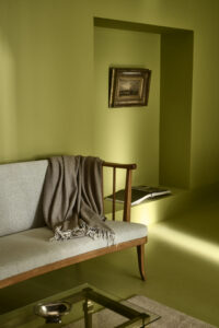
A mid-tone yellow-green, or olive-lime, that feels both restorative and energetic.
The Design Intent Quiet Vitality. To bring the invigorating feeling of the outdoors in, perfect for spaces needing a boost of creativity and focus.
Pair with sleek, dark metals like matte black or bronze and clean-lined furniture.
The complimentary palette leans to Vibrance: Muted plum, Deep Navy, Bright White.
Valspar Warm Eucalyptus (8004-28F)
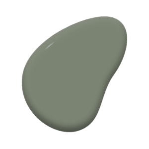
A serene, earthy green softened by warm, silvery gray undertones.
The Design Intention is Calm Neutrality. To create a restful, balanced environment that acts as a sophisticated neutral base
The pairing focus here is Oganic Texture. Pair with linen, bleched wood, natural stone and clay/terracotta ceramics.This complementary palette pairs with softness: Soft Blue-Grays, Mushroom Taupes and Creamy White.
I said we would talk more about texture. I don’t think there is a blog I’ve done that doesn’t mention the importance of adding texture and again this playsinto the 2026 colors.
So, here it is. When working with complimentary colors, always remember the importance of texture. I can’t stress enough how much texture adds to any room (linen, wood, velvet). Texture is the one element that is often underutilized. It also helps prevent the rich colors from falling flat. One way to bring in texture is through your window treatments.
Designing with Intention: Why 2026 is Your Year for Color
What makes the 2026 Palette so exciting is its intentionality. These colors are not fleeting fads; they are built to last, offering a powerful valance of drama and tranquility. Whether you chose the grounding charcoal-laced espresso of Silhouette for your built-ins, the airy serenity of Warm Eucalyptus for your bedroom, or the timeless flexibility of Universal Khaki as your backdrop, these colors are an invitation to infuse your home with soul and sophistication.
The greatest trend of all is layering. Don’t be afraid to pair a warm khaki wall with a rich, deep-green accent pillow, or use brass fixtures to pop against a deep brown cabinet. By embracing these natural, multi-dimensional hues, you can create a home that truly feels grounded, alive and uniquely yours. The possibilities are endless.
Which 2026 Color of the Year is your favourite? How do you plan to incorporate these colors into your home? Let’s have a design consultation.


